
If you’ve spent any time building websites with Divi, you know how powerful the visual builder is. But to truly unlock its potential and create perfectly responsive designs, understanding how to control the size of your elements is absolutely key.
We’re talking about CSS sizing units! You’ve probably seen options like px, %, em, and maybe even vh or vw in Divi’s settings. But what do they all mean, and when should you use which one?
Choosing the right unit isn’t just about making things look good on your screen; it’s about ensuring your design scales beautifully across all devices, from massive desktop monitors to tiny phone screens. Let’s dive in and demystify these essential CSS units!
Why Sizing Units Matter in Divi
Divi makes responsiveness easier with its built-in settings for different devices. However, when you start digging into module settings, custom CSS, or even just fine-tuning padding and margins, you’ll encounter these units. Using them correctly is fundamental to creating flexible layouts that adapt rather than break.
Think of these units as different rulers you can use to measure your design elements. Some rulers are fixed, while others change length depending on what they’re measuring against. Understanding this is the first step to mastering responsive design in Divi.
The Usual Suspects: px and %
These are likely the most common units you’ll see and use initially in Divi. They represent the foundational ways to size elements, one absolute and one relative to its immediate container.

Pixel (px) – The Absolute Ruler
- What it is: Pixels are an absolute unit of measurement in CSS. Simply put, one
pxis intended to correspond to a single physical dot or pixel on a computer screen. Think of using a traditional physical ruler – a centimeter is always a centimeter, and a pixel, in theory, is a fixed point of measure on the display. - In Divi: You’ll frequently encounter
pxin Divi’s design settings, particularly for precise controls like Border Widths, fixed-size elements, and specific values for Padding and Margin when you need an exact, unchanging amount of space. - Best Use Cases: Use
pxwhen you require a very specific and non-scaling size, such as defining the exact thickness of a border (e.g.,2px solid #000), setting the size of a small decorative icon that shouldn’t change, or creating consistent, fixed gaps (though be mindful of responsiveness when using fixed padding/margins extensively). - The Upsides: The main advantage of using
pxis its predictability and precision. What you set is exactly what you get, making it easy to visualize and control sizes in a very literal way. It’s also the most straightforward unit for beginners to understand. - The Downsides: The primary drawback is that
pxis not responsive. An element sized in pixels will maintain the same physical size relative to the screen’s resolution, meaning a 200px element might look reasonably sized on a desktop but massive and overflowing on a mobile screen. This lack of flexibility makes it less ideal for elements that need to adapt fluidly across different devices.
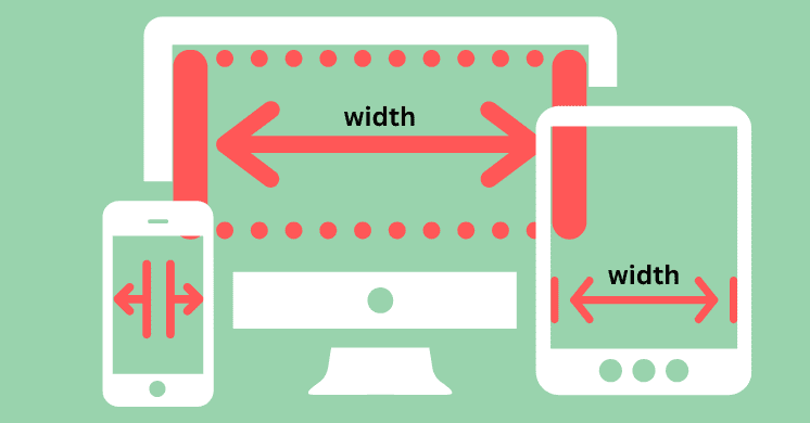
Percentage (%) – The Relative Ruler (to Parent)
- What it is: Percentages are a relative unit. A percentage is calculated based on the size of the element’s containing block (usually its parent element). Think of it like taking a slice of a pizza – the size of your slice (percentage) depends entirely on the size of the whole pizza (the parent element).
- In Divi: Used extensively in Divi’s layout settings, particularly for defining the Widths and Maximum Widths of sections, rows, columns, and modules. It allows elements to take up a proportion of the space available within their direct container.
- Best Use Cases: Percentages are fantastic for creating flexible, fluid layouts . Use them to define column widths within a row (e.g., a 50% width column), make containers scale proportionally with their parent, or set maximum widths to keep content from stretching too wide on large screens.
- The Upsides: Percentages are great for responsiveness , allowing your layout elements to adapt and reflow based on the size of their parent container. They help create fluid designs that utilize available space efficiently.
- The Downsides: Sizing with percentages can sometimes be unpredictable if the parent element’s size isn’t clearly defined or is based on other complex relative calculations. Using percentages for height can also be tricky unless the parent element has a defined height.
The Power of Relative Typography: em and rem
These units are particularly powerful when dealing with text sizing and spacing that you want to scale in a controlled, accessible way. They are relative not to the parent container’s dimensions, but to font sizes.

In ( em) – Relative to the Parent Font Size
- What it is: An
emunit is relative to the font size of the parent element . If the parent element has a computed font size of 16px, then1eminside that element equals 16px. If you then set a nested element’s font size to1.5em, its size will be 1.5 times the parent’s 16px, resulting in 24px. - In Divi: While not always a primary option in standard module typography settings,
emis a unit you might see or use in custom CSS within Divi to size elements or add padding/margins that should scale relative to the surrounding text size. - Best Use Cases: Use
emfor setting padding or margins on elements where you want the spacing to scale proportionally with the text size of the parent or current element . It’s useful for creating components where sizing is contextually tied to the immediate typography. - The Upsides:
emunits are great for creating scalable components where internal spacing or element sizes should adjust automatically if the parent’s font size changes (perhaps due to responsive settings or user accessibility options). - The Downsides: The main drawback of
emis the potential for compounding . If you have multiple nested elements, and each usesemunits based on its parent, the sizes can multiply down the chain, leading to unexpectedly large or small results.
Rem ( rem) – Relative to the Root Font Size
- What it is: A
remunit (short for “root em”) is relative to the font size of the root HTML element (<html>). By default, most browsers set the root font size to 16px, so1remtypically equals 16px unless that root value is changed (often in theme options or base CSS). This provides a single, consistent point of reference for scaling. - In Divi:
remis increasingly used for typography settings in newer Divi versions and is the preferred unit by developers for creating consistent, scalable typography across an entire website. You might also find it as an option for padding and margin inputs. - Best Use Cases:
remis ideal for setting font sizes across your entire site to ensure consistent scaling based on a single value. It’s also excellent for defining padding and margins that you want to scale proportionally when the base font size (and thusrem) changes, which is crucial for accessibility and user zooming. - The Upsides:
remavoids the compounding issues ofemby always referencing the root font size. It provides consistent and predictable scaling for typography and spacing site-wide, making it a cornerstone of modern responsive design and accessibility. - The Downsides: The only real “con” is that its value depends on the root font size, which you need to be aware of. However, this consistency is generally considered a major advantage.
Viewport Units: vw and vh
These units are fantastic for creating elements that are sized relative to the size of the user’s browser window, or “viewport.” They offer a direct way to tie element size to the overall screen dimensions.
Viewport Width ( vw) – Relative to Viewport Width
- What it is:
1vwis equal to 1% of the viewport width (the width of the user’s browser window). This means a 100vw element will span the full width of the browser window, minus any scrollbars. - In Divi: Useful for creating elements that you want to span a certain percentage of the full screen width, regardless of the parent container’s width. You might use it for text that should scale dramatically with screen width or for elements that need to break out of standard column layouts via custom CSS.
- Best Use Cases: Use
vwwhen you want an element’s size to scale directly with the width of the screen. A common use is for large, responsive headlines where the font size is set usingvw(e.g.,font-size: 5vw;). It’s also useful for elements that need to be a percentage of the total screen width, not just their parent container. - The Upsides:
vwis excellent for highly responsive sizing based directly on the screen width, allowing elements to scale fluidly and predictably across different device sizes. - The Downsides: Using
vwalone can lead to elements (especially text) becoming very small on tiny screens or excessively large on huge screens if not combined with minimum or maximum size properties to constrain the scaling.
Viewport Height ( vh) – Relative to Viewport Height
- What it is:
1vhis equal to 1% of the viewport height (the height of the user’s browser window). This unit allows you to size elements based on the vertical space available in the browser window. - In Divi: Most commonly used for creating sections or elements that should take up a specific proportion of the user’s visible screen height upon loading.
- Best Use Cases:
vhis ideal for creating full-screen “hero” sections at the top of your page (by setting the section or row minimum height to100vh). It’s also useful for ensuring an element is at least a certain percentage of the screen height on load, providing consistent vertical spacing or visual impact. - The Upsides:
vhis perfect for creating elements that are consistently sized relative to the user’s screen height, ensuring a specific visual impact or layout structure regardless of screen orientation or size. - The Downsides: Using a fixed
vhheight can sometimes cause content overflow on smaller screens or if users have very large text sizes, potentially hiding content below the fold unless careful consideration is given to content length and alternative sizing on different devices.
Other Units to Know (Briefly)
While less common for general users within the standard Divi interfaces, these units are part of the CSS landscape and might appear in custom code or advanced scenarios.
min-content/max-content: These values size an element based purely on the size of its content.max-contentis the largest the element can be without any of its content overflowing or breaking (e.g., the width needed to display a sentence on a single line).min-contentis the smallest the element can be before its content starts overflowing its own box (e.g., the width of the longest word). These are powerful for layout control, often used in conjunction with CSS Grid or Flexbox, allowing elements to size themselves dynamically based on their text or image content.auto: The browser automatically calculates the value. This is used extensively by default in Divi for many properties like width, height, margin, and padding, allowing elements to size themselves based on their content, their siblings, and their parent container according to CSS Box Model rules.
Combining Units for Responsive Magic
The true art of responsive design lies in knowing how to combine these units effectively. No single unit is a silver bullet; they work best in concert.
- Use
%for the overall structure and width of your layout containers (sections, rows, columns) to keep things fluid and adapting to their parents. - Use
remprimarily for font sizes and potentially consistent vertical spacing (padding/margins) to create scalable typography that adjusts nicely for different screen sizes and user accessibility settings. - Use
pxfor small, fixed details that should not scale, such as border thicknesses , small icons, or very specific minimum/maximum spacing values that you need to remain constant. - Use
vhfor elements that should occupy a consistent proportion of the user’s screen height, most notably for full-screen hero sections . - Use
vwmore cautiously, often for text elements that should scale significantly with screen width (like headline text), and frequently pair it withmin-font-sizeormax-font-sizein custom CSS to prevent extreme scaling on very large or small screens.
Remember, Divi’s responsive settings allow you to set different values for many properties (in px, em, rem, etc.) for desktop, tablet, and phone breakpoints, giving you incredible control over how your design adapts.
Practicing in Divi
The best way to solidify your understanding is to get hands-on!
- Open the Divi Builder on a test page.
- Add any module, row, or section.
- Go into its Design tab and look for sizing-related options like Width, Max Width, Height, Min Height, Padding, Margin, or Text Sizes.
- Click the unit type next to the input field (it often defaults to
px) to cycle through the available units (px,%,em,rem,vw,vhwill appear depending on the setting). - Experiment by setting different values using different units. Then, switch between the desktop, tablet, and phone preview modes in the Divi Builder’s bottom bar to see how your element’s size changes (or doesn’t change!) based on the unit you chose. Observe how
%behaves relative to the column/row, howvhimpacts height, and howremscales text.
This practical exploration will make the concepts much clearer than just reading about them.
Conclusion
Mastering CSS sizing units might seem a bit technical at first glance, but it is a fundamental skill for anyone serious about building professional, responsive, and accessible websites with Divi. Moving beyond relying solely on px unlocks a world of flexibility.
By understanding the difference between absolute units like px, relative units like %, em, and rem, and viewport-based units like vw and vh, you gain the power to create layouts that are not just visually appealing on your screen but also incredibly flexible and user-friendly on any device your visitors use.
Start experimenting with these units in your Divi projects today, paying attention to how they behave in different screen sizes, and you’ll quickly see how they can elevate your design skills and the quality of your Divi websites!
