
Your website’s menu is more than just a list of links; it’s a critical gateway to your content, services, and products. For websites with a vast amount of content, multiple categories, or complex hierarchies, a standard dropdown menu can quickly become overwhelming and inefficient. That’s where the mega menu comes in!
A mega menu is a sprawling, multi-column dropdown menu that appears when a user hovers over or clicks a top-level navigation item. Unlike traditional dropdowns, mega menus can contain rich content like images, videos, descriptions, and organized categories, turning your navigation into a powerful content discovery tool. It’s about providing a comprehensive, visually rich overview of your site’s offerings at a glance.
The Benefits of Embracing a Divi Mega Menu
Implementing a mega menu on your Divi website can offer a wealth of advantages, particularly for content-heavy sites or e-commerce stores:
- Enhanced Discoverability: By presenting a large array of links and content categories simultaneously, users can quickly scan and find what they’re looking for without multiple clicks or tedious drill-downs. This significantly improves content discoverability.
- Improved User Experience (UX): A well-designed mega menu reduces cognitive load. Instead of remembering where they are in a deep navigation path, users see all options laid out clearly, leading to a more intuitive and less frustrating Browse experience.
- Visual Engagement: Mega menus are not just about functionality; they offer immense creative potential. You can incorporate images, icons, promotional banners, or even product previews directly within the menu, making your navigation a visually engaging part of your design.
- Reduced Clicks & Faster Journeys: Users can jump directly to deeply nested pages or specific product categories, reducing the number of clicks required to reach their destination. This streamlined journey can lead to higher conversion rates and greater user satisfaction.

Ideal Use Cases for a Divi Mega Menu
Mega menus shine brightest in specific scenarios where content volume and diverse categories are key:
- E-commerce Stores: For online shops with hundreds or thousands of products across many categories and subcategories, a mega menu allows customers to quickly browse by department, brand, or even specific product features, often showcasing popular items or sales.
- Large Content-Rich Blogs/News Sites: Websites with a vast archive of articles, different content verticals (e.g., technology, fashion, finance), or extensive resource libraries can use mega menus to categorize content by topic, author, date, or content type, making it easier for readers to navigate the depth of information.
- Corporate & University Websites: These sites often have numerous departments, services, courses, or resources. A mega menu can organize this complex information logically, allowing visitors to easily find specific sections like admissions, faculty, research areas, or student services.
Mega Menus on Mobile & Tablet
This is a crucial consideration, and the consensus among UX professionals is nuanced.
- Desktop: Mega menus are generally highly effective and recommended on desktop screens dueadesktop’s larger screen real estate. They provide ample space for rich content and multiple columns, significantly enhancing navigation for complex sites.
- Mobile & Tablet: On smaller screens, the traditional “mega menu” as seen on desktop typically falls short. Cramming a multi-column, rich-content menu onto a narrow mobile screen leads to:
- Poor Readability: Text becomes tiny, and multiple columns become unmanageable.
- Usability Issues: Tapping accurately on small links within a crowded space is difficult.
- Performance Problems: Loading a lot of hidden content (images, extra HTML) for a mega menu can slow down mobile site performance.
- User Expectation: Mobile users are accustomed to “hamburger” menus that reveal a simple, scrollable list of links, often full-screen.
Therefore, general UX research and best practices strongly suggest that mega menus should be:
- Desktop-Specific: Design your mega menu explicitly for larger screens.
- Replaced with Mobile-Optimized Navigation: For mobile and tablet views, when the hamburger icon is tapped, you should present a simplified, vertically stacked, and easily scrollable menu. This often means reverting to a standard, full-screen overlay menu that is touch-friendly and prioritizes clear hierarchy over visual richness. While some elements (like top-level categories) might remain, the “mega” aspect (multiple columns, heavy content) should be stripped back for the mobile experience.
Divi’s responsive settings are perfect for this. You can build your desktop mega menu using Divi’s builder elements and then configure its visibility to Desktop Only, while ensuring your mobile menu uses Divi’s standard, mobile-optimized navigation or a separate, simplified menu structure.
Build Your Divi Mega Menu
Create a Divi Mega Menu using a Plugin
While the power of plugins often provides a quick and easy solution for adding features like mega menus to your Divi website with just a few clicks, sometimes you want to achieve a sophisticated look without adding yet another plugin to your arsenal. Many powerful tools are already built right into Divi, waiting to be leveraged for advanced functionalities.
Some of the notable plugins are:
- The Ultimate Divi Header & Menu Builder Bundle (save money by getting the bundle)
- DiviMenus
- Divi Super Custom Menus
- Divi Mad Menu
- Divi Mega Menu Pro
Build a Divi Mega Menu WITHOUT a Plugin
In order to achieve this we are going to use a little bit of CSS and the hidden built-in functions that Divi already has.
No experience in CSS? No need to worry, I got you covered as I will walk you through how to do it step by step.
Let’s get started!
1 Add a Menu
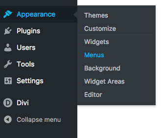
Log in to your WordPress dashboard and go to Appearances > Menus.
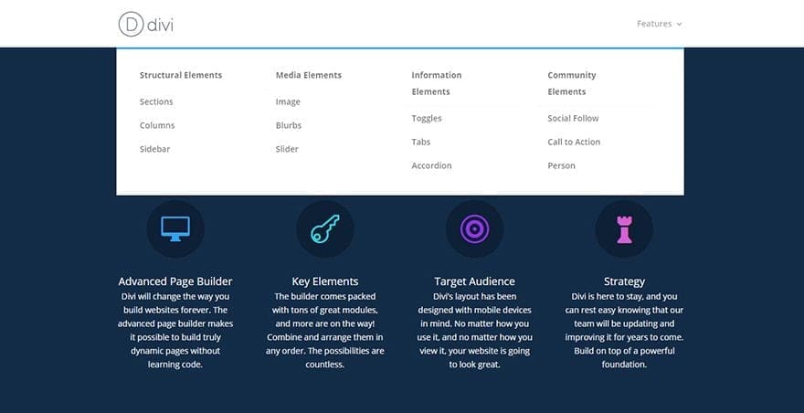
Create your menu by adding in up to four parent links. Under each parent link you can add the submenu links. In the image below, I have added three submenu items under each of the four parent menu links.
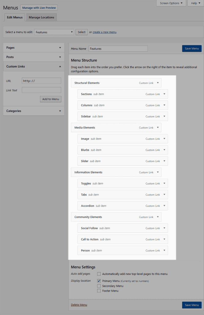
2 Structure the Menu
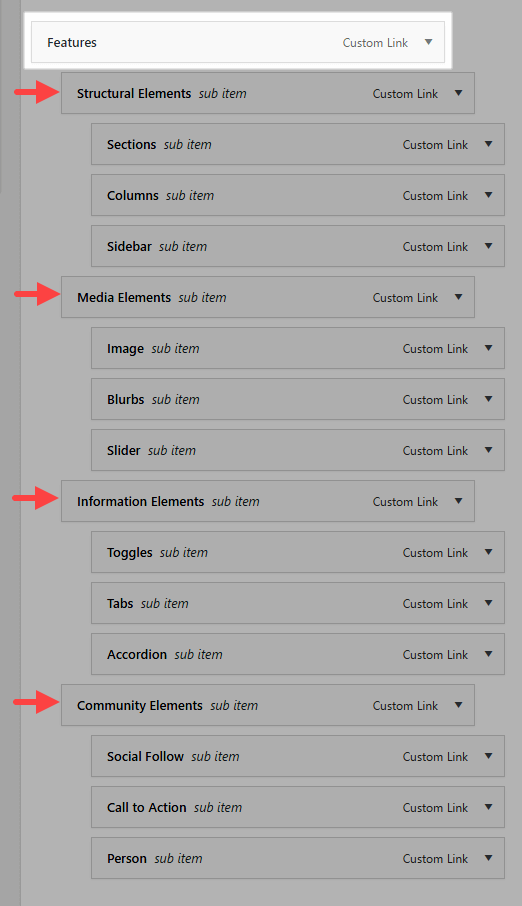
Now that we have our menu created we will have to wrap this in the mega menu. We can do this by providing another parent menu item. In the example below – an option Features has been added to the menu.
3 Activate the Mega Menu
To activate the mega menu feature of Divi you will need to place the parent menu item in a CSS class.
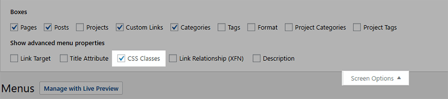
Before we do that let’s ensure that you have the option enabled to use CSS classes in your menu. To do, click on the screen options in the top of screen and make sure that the CSS Classes is checked/enabled.
Once you have that enabled, head back to your menu and click on the small arrow to the right of the Features menu option to expand the details of that menu item. You should now see the option to add in a CSS Class. Add in the following class: “mega-menu” to activate the mega menu.

And that should be it. If you now reload your frontend page of your website and hover over the Features option in the menu,, you should see the newly created mega menu.
4 Add in Images
This is an optional add-on to make your menu stand out even more.
Get yourself four images that relate to each of the menu items (About Us, Services, Portfolio, and Contact us).
Keep your images a little on the smaller size – using a width of 500px and a height of 300px should work.
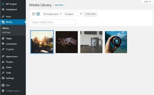
Once you are happy with your images, add them to your WordPress Media Library.
5 Add in the Code
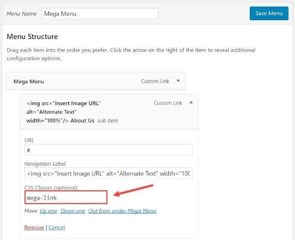
We are going to use a bit of HTML to get the desired effect. Click the arrow to the right of the first menu item (not the Features but one level down) and look for the Navigation Label.
We want to wrap the Navigation Label with the following code:
<img src=”Insert Image URL” alt=”Alternate Text” width=”100%” />Navigation Label</img>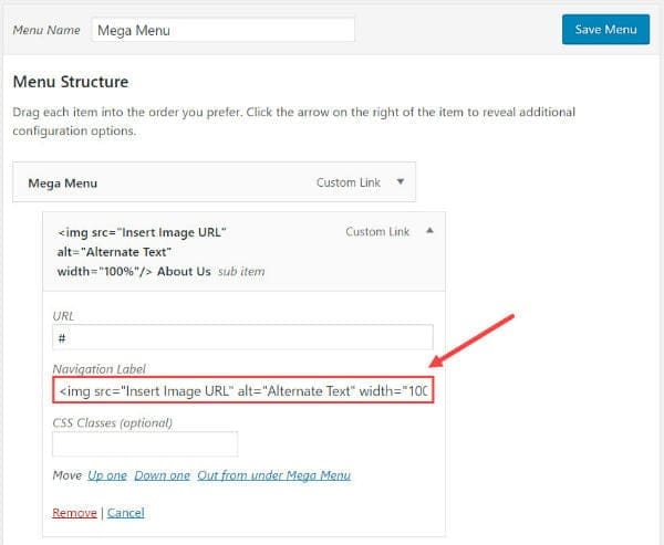
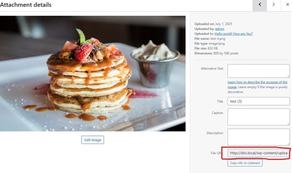
To find the url to the image, go to Media → Library. Click the image you want to add. In the Attachment Details popup screen find the url in the section to the right, highlight it, then use ctrl+c to copy it to your clipboard.
Head back to the first item in the menu (in my case Structural Elements) and replace the text “Insert Image URL” by pasting the URL of the image you just copied by using ctrl+v.
Before we wrap up with this menu item, we just need to give it a CSS class too. At the CSS class box enter the class “dd-mega-link.”
dd-mega-linkThis will allow us the opportunity to style it later on.
Repeat this process for the remain menu items. Once complete, head over to the front end of your website and hover over the Mega Menu (in my case Features) and it should look something like the image below.
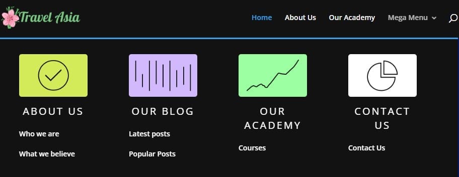
If you hover over any of the images you will notice they have a fade effect much the same as the submenu items underneath. This is due to the image also being a part of the link.
6 Styling the Menu
The final step is to style the menu. Let’s add some custom CSS to make the font bigger and centered. Also, we can give it a border radius around the image to make it look cleaner and a little more modern.
Head to your WordPress Admin and go to Divi → Theme Options. Once there, scroll down to the bottom custom css area and enter the following CSS:
.dd-mega-link > a {
    text-align: center;
    font-size: 20px !important;
    text-transform: uppercase;
    font-weight: 400 !important;
    letter-spacing: 3px;
}

.dd-mega-link > a img {
    margin-bottom: 8px;
    -webkit-border-radius: 5px;
    -moz-border-radius: 5px;
    border-radius: 5px;

}
Save changes and you are all done! You should now have a working Divi mega menu.
Navigating Towards a Better User Experience
A well-implemented mega menu can truly transform the navigation experience on your Divi website, especially for content-rich platforms. By offering a comprehensive yet organized overview of your site’s offerings, you empower your users to find what they need faster and with greater ease, leading to increased engagement and satisfaction.
Remember to leverage the power of Divi to build your desktop mega menu, and always prioritize a clean, mobile-optimized navigation solution for smaller devices. Dive in, experiment, and revolutionize how your visitors navigate your Divi site!
