Animations are awesome I know. Seeing how all the elements on the screen spring to life as you scroll through the site is really something to enjoy. That said, when viewing on mobile, animations can become a bit more of a nuisance than a novelty. In this article, I hope to quickly teach you how to disable the divi animation effects on mobile so that you are not beholden to them on all devices.
Disabling Animation Effects on Mobile
One of the things we love about the Divi builder is the fact that it makes building a sites that look complex simple. Adding animations on a desktop view can really liven up your website. But what if you do not want it to show on mobile?
Quick CSS Solution to Disable Animations
I have not found any setting in the options that makes this change as yet so we will have to solve this with some CSS.
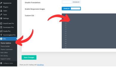
If you head to your Divi -> Theme Options -> General -> Custom CSS

In the Custom CSS field copy and paste the following code into it
@media all and (max-width: 981px) {
	.et_pb_section * {
		-o-transition-property: none!important;
		-moz-transition-property: none!important;
		-webkit-transition-property: none!important;
		transition-property: none!important;
		-o-transform: none!important;
		-moz-transform: none!important;
		-ms-transform: none!important;
		-webkit-transform: none!important;
		transform: none!important;
		-webkit-animation: none!important;
		-moz-animation: none!important;
		-o-animation: none!important;
		animation: none !important;
	}
      .et_animated {
		opacity: 1 !important
	}
}
Once the code is pasted in, be sure to click the Save Changes button at the bottom and you should be done.
From now on, all animations should be disabled on mobile but still show on screens larger than 981px (likely laptops and desktops)


